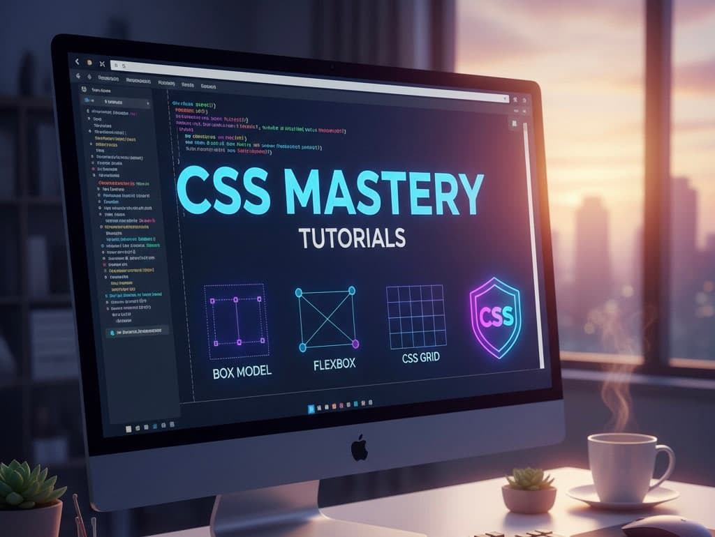
Introduction to CSS
Cascading Style Sheets, or CSS, is a powerful tool for web development that allows designers and developers to control the look and feel of a website. Imagine CSS as the paintbrush that artists use to create visually stunning pieces of art. In this detailed tutorial, we'll uncover the essentials of CSS, breaking down complex concepts into easy, digestible sections. Whether you're a complete novice or someone looking to refresh your skills, this guide is tailored just for you.
What is CSS?
CSS stands for Cascading Style Sheets, and its primary purpose is to style web pages. It works alongside HTML, which provides the structure of your web content. You can use CSS to adjust colors, fonts, layouts, and much more. The beauty of CSS lies in its ability to separate content from design, allowing for clean and maintainable code.
The Importance of CSS in Web Development
In today’s digital world, the appearance of a website is crucial. A well-styled page enhances user experience and keeps visitors engaged. Studies have shown that users form opinions about a website within milliseconds, and design plays a significant role in those first impressions. CSS provides developers with the flexibility to create visually appealing sites without compromising functionality.
Getting Started with CSS
Before you can dive into CSS, you'll need a basic understanding of HTML. Once you have that down, getting started with CSS is straightforward. Here are the three primary ways to add CSS to your HTML document:
- Inline CSS: You can add CSS styles directly to an HTML element using the 'style' attribute. For example:
- Internal CSS: You can include styles in the
<head>section of your HTML document using the<style>tag. - External CSS: The most efficient method, where you create a separate CSS file and link it to your HTML document. This allows for easier maintenance and reusability.
<p style="color: blue;">This text is blue.</p>
<style>
      p { color: blue; }
  </style>
<link rel="stylesheet" type="text/css" href="styles.css">
CSS Selectors and Properties
Once you've set up your CSS, the next step is understanding selectors and properties. A selector is used to target an HTML element, while properties define the styles applied to that element.
Types of Selectors
Here are some common CSS selectors:
- Element Selector: Targets HTML elements based on their tag names. For example,
p { color: red; }will style all<p>elements. - Class Selector: Targets elements with a specific class. For example,
.classname { font-size: 20px; }. - ID Selector: Targets an element with a specific ID. For example,
#header { background-color: blue; }.
CSS Box Model
The CSS box model is a fundamental concept that every web developer should understand. It describes how the spacing of elements is calculated, including margins, borders, padding, and the actual content area. Here's a quick breakdown:
- Content: The actual content of the box, where text and images appear.
- Padding: The space between the content and the border. Padding is transparent and can be adjusted using properties like
padding: 10px;. - Border: A border surrounds the padding (if any) and the content. You can change its style, color, and width.
- Margin: The outermost space around the box, used to create distance between elements.
Understanding the box model is crucial for controlling the layout of your web pages effectively.
Styling Text with CSS
Text styling is one of the most common use cases for CSS. You can adjust font size, family, color, alignment, and spacing between letters. Here’s a glimpse into text styling with CSS:
h1 { font-family: Arial, sans-serif; color: #333; text-align: center; }
This example centers the heading and changes its color and font. Experimenting with different properties will help you find the right style for your content.
Layout Techniques
CSS offers multiple layout techniques that allow for responsive designs that adapt to different screen sizes. Here are some popular methods:
- Flexbox: A layout model that provides a more efficient way to lay out, align, and distribute space among items in a container.
- Grid: A two-dimensional layout system that allows for complex designs using rows and columns.
- Positioning: Using CSS to position elements in relation to their normal position, the viewport, or other elements.
Each method has its strengths and is best suited for specific layout challenges. Understanding when to use each technique will significantly improve your development skills.
Responsive Design with CSS
In an age where users access websites from various devices, responsive design has become essential. CSS media queries enable you to apply different styles based on the viewport's characteristics. Here’s a basic example:
@media only screen and (max-width: 600px) {
    body { background-color: lightblue; }
}
This will change the background color to light blue for screens smaller than 600 pixels, enhancing user experience across devices.
Debugging CSS
Debugging is a crucial skill for any developer, and CSS is no exception. Tools like the browser’s inspector can help diagnose styling issues. Here are some tips:
- Inspect elements to see computed styles in real-time.
- Use online validators to check your CSS for errors.
- Comment out sections to isolate issues.
By following these practices, you can minimize frustration and resolve issues quickly.
Resources for Further Learning
To deepen your understanding of CSS, consider exploring the following resources:
These platforms provide a wealth of tutorials, examples, and documentation to help you navigate the world of CSS.
Conclusion
Learning CSS can be an exciting journey, offering endless possibilities in web design. By grasping the basics outlined in this tutorial, you're well on your way to creating beautiful, responsive web pages. Keep practicing, experimenting, and exploring new techniques, and soon you'll find yourself crafting designs that not only look great but also enhance user experience.